- Getting Started
- Introduction
- Installation
- Implementation
- Principles
- Templates
- Colors
- Icons
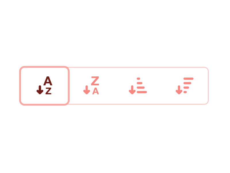
- Components
- Badge
- Breadcrumbs
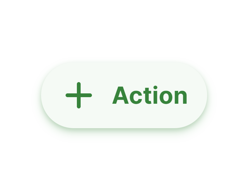
- Button
- ButtonGroup
- Callout
- Card
- CheckBox
- Chips
- Counter
- DatePicker
- DateRangePicker
- Dialog
- Divider
- Drawer
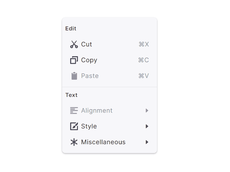
- Dropdown
- Hamburger
- Input Default
- Input Search
- Menu
- Navbar
- Progress Bar
- Radio Button
- Slider
- Spinner
- Switch
- Table
- Tab Default
- Tab Segmented
- TimePicker
- Toaster
- Tooltip
- Tree
- Typography
- WebApp demo
- Home
- Dashboard
- Data grid
- Profile
- Inputs
React UI kit
Introduction
Setproduct Design System is the unlike React UI kit. IncludingFigma design sources+ React components based on enhanced and restyled BlueprintJS library this system saves «a penny», because you skipping a pixel routine and get ready to use components & templates (soon!) kit on hands to build apps faster.
What’s the purpose
2-in-1 toolkit for teams, individual developers, or designers who code. Designed and well-organized in Figma and served as the components library powered by auto-layout. Styles and specs were translated manually and styled in ReactJS. This product guarantees you the speeding up your workflow, obtaining UI consistency and bringing more visual aesthetics to your apps.
What’s the difference
Setproduct Design System provides Flat, Filled, Smooth, Outlined or Raised instances for every component, UI widget or template. Pick a Flat style for simple and data-fist UI or go with Raised if you’re a fan of Material Design. We tried to cover all the style variations ever possible in the user interface design and make it easy to swap both in React and Figma.
Set a UI theme by swapping props and Figma instances. For the rest of components there are 4+ styles available.
Build UXeful interfaces with a toolkit where all the details considered. Hovers, clicks, timings & animation.

States are neatly maintained for any component to interact with. We reimagined styles for the smooth and better user experience.
Get inspired by interacting with the polished components. We aimed to build huge patterns gallery and release it as templates.
Setproduct Design System
for Figma & React